FloEnvy
Cannabis Cultivation Software for small and large-scale operations.
A project from happyMedium
-
My Contributions
User Research
UX and UI Design
-
The Team
Me, Product Designer
-
Duration
Jan ‘22 - Feb ‘23
-
Project Type
Web Application Menu Redesign
-
Tools Used
Figma, Figjam, Jira
The Process
01 - Planning and Discovery
The project began with gathering requirements and performing an audit of the existing menus and navigation. Based on the findings, recommendations were made on how to improve the menus and navigation.
02 - User Research
I conducted secondary research by examining previous studies and recommendations put forth by trusted UX professionals. Additionally, I analyzed examples from products with extensive and complex menus.
03 - User Experience Design
I validated my design decisions by utilizing the research and examples I found and created a new menu structure and also adjusted the colors to be more accessible.
The Results
The previous menu was difficult to navigate because it was located solely at the top, had repeating words, and was not clear. Additionally, it was layered, so users were unaware of other options until after navigating to a particular page. Another menu was hidden under the profile/avatar section, which hid relevant options for users.
To improve the menu, I made the following adjustments:
Moved the navigation to the side to make it collapsible and take up less space.
Made adjustments to the content to make it clearer.
Made the layers and hidden menu options available as drop-downs in the new menu.
Changed the colors used in the menu to ensure that they meet WCAG standards, while still adhering to their design system.
These changes follow common patterns used in more complex sites and products, such as Notion or Jira. The new menu is now more user-friendly, accessible, and easier to read.
Previous Designs and New Solutions
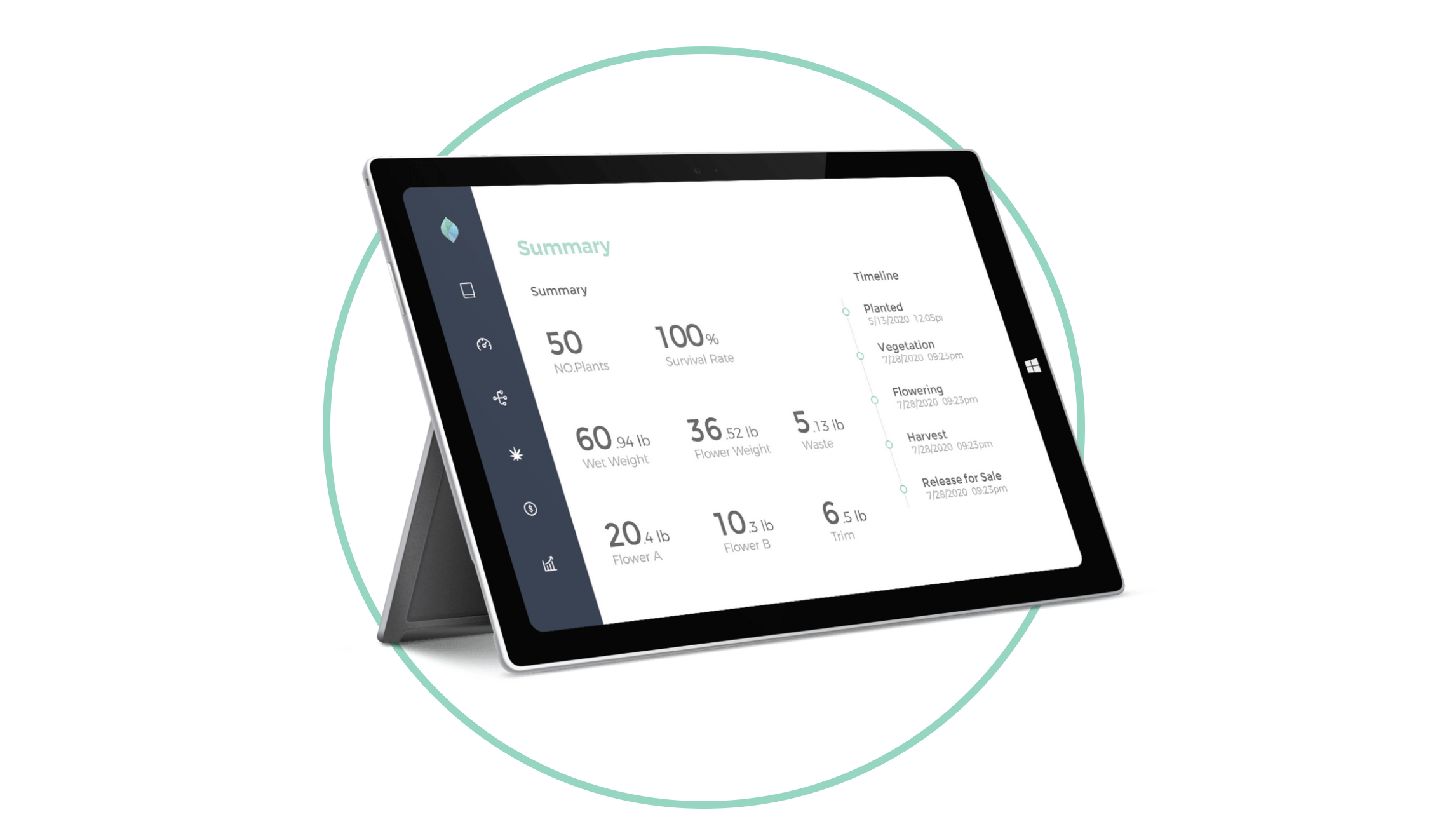
Old Menu Designs
The previous top menu was difficult to navigate as it was located solely at the top, had repeating words, and was not clear. It also contained hidden layers, so users were unaware of other options until after navigating to a particular page. There was another menu that was hidden under the profile/avatar section, which contained relevant options for the users. The menu was also difficult for users to read due to the colors used. The combination of white-on-light-green or light-green-on-white was not easy to read and did not meet accessibility standards.

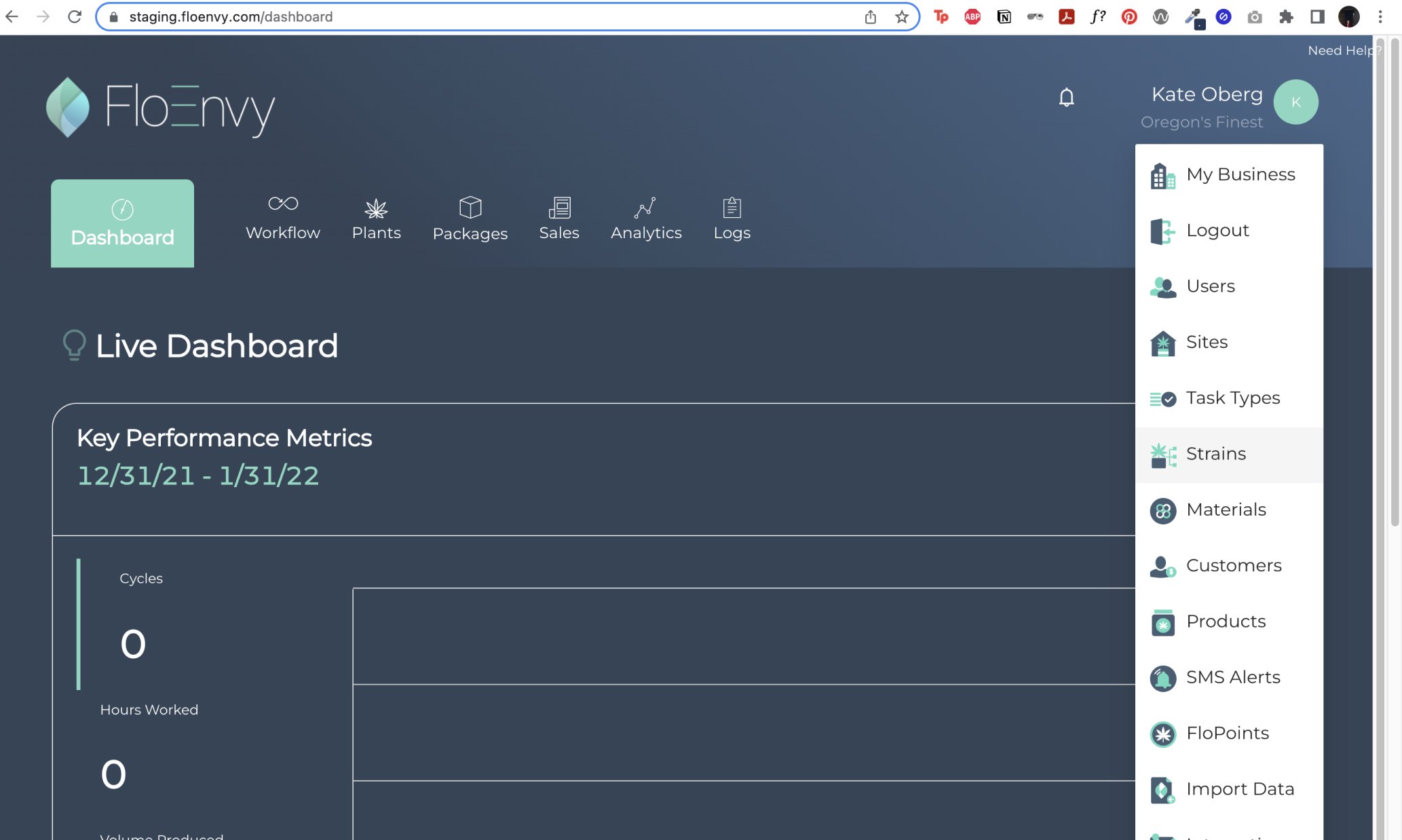

New Menu Designs
I moved the navigation to the side to make it collapsible and take up less space. This follows common patterns used in more complex sites and products, such as Notion or Jira. I also made adjustments to the content to make it clearer and made the layers and hidden menu options available as drop-downs in the new menu. To address accessibility and readability, I changed the colors used in the menu to ensure that they meet WCAG standards, while still adhering to their design system.

